
As a graphic designer, your clients will require you to create a variety of unique projects. While some projects, such as map building, are sometimes viewed as mundane and unimaginative, it can’t hurt to instill a little creativity when working on them. In doing so, you will push your limits as a designer and avoid the far too common creative burnout. The following are five examples of how designers have transformed their infographics from traditional, mundane assignments into visually appealing and thought provoking masterpieces.
Dorina Nowill Foundation for the Blind: Metro Map
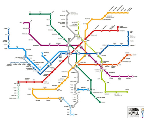
Passersby of this effective metro map advertisement are provided a new world perspective through the eyes of visually deficient individuals. With each stop in the metro station labeled by a physical reminder, viewers are provided a snapshot of how different the world is for those with disabilities. This infographic displays the great power available in helping people think outside of their everyday perspectives. It has also certainly gained more visibility for the Dorina Nowill Foundation for the Blind.
NYC Subway City as Seen by a Three-Year-Old

Things always look different when viewed through a child’s eyes. This was the viewpoint taken by the creator of this subway map for the New York City subway system. Complete with top NYC attractions such as the Museum of Natural History, this map offers everything you need to get around the city – if you are a three-year-old.
Tokyo Metro: Mapping the Internet

As chaotic as the online world is, props must be extended to the designer of this infographic who used a subway map metaphor to map out the Internet. With special attention given to the popular social networks and most visited websites, the map is surprisingly accurate.
The Gastrointestinal System Represented as a Subway Map

Talk about a visual awakening. This designer took a digestive route with this metro map by visualizing it as a gastrointestinal system. As dark and scary as some metro systems can be, this infographic offers the perfect analogy – especially the blue line.
Sony Walkman: London Underground

When taking public transportation, it seems that everyone is now plugged into personal audio players. The designer of the London Underground metro map capitalized on this trend by designing an infographic completely from Sony Walkman ear buds. By simply thinking outside the box, the designer had a little fun with the metro map design and has undoubtedly earned a few laughs from the London Underground metro users.
While each takes a very different approach to the creation of infographics, all of the above examples show the power that is available from infusing a little creativity into the most mundane of assignments. Both thought provoking and comical, each infographic shows how leading designers allow their audience members to view the world from a new perspective.
During your career as a graphic designer, you will surely be assigned less than desirable projects. However, as evidenced in the examples above, it’s up to you to transform these seemingly unimaginative assignments into pieces of art that will capture the attention of passersby. In doing so, you will flex your creative muscles and display your true graphic design abilities.

Pingback:Exceptional public transit maps « MU Information Graphics Fall 2012