Online social networks are likely the largest phenomena to hit the Internet. Millions of people across the world now use these networks to connect with others for personal and professional reasons. One of the largest of these networks is Twitter, where people can constantly update their followers on whatever crosses their mind.
With this explosion of Tweets, designers have begun conceptualizing how the Twitter craze would appear artistically. Following are five amazing examples of these artistic visualizations.
Just Landed
The Just Landed Twitter visualization creates a geo-tracking each time Twitter users mention the words “just landed in.” When a user mentions those words, Just Landed tracks where the tweets are sent from, where the Twitter users landed in and then creates a geo-visualization based on this information. This visualization is amazing for the conceptualization it provides but is also a little scary based on how much information it can collect from Twitter users.
Twistori

People regularly use Twitter as a platform to tell others how they are feeling. Messages of love, hate, and other emotions regularly flood this social network. Twistori takes these emotional expressions and transforms them into a stream of updates. It is both artistically simple yet extremely complex by displaying how Twitter users across the world are feeling at any given moment. Feeling a bit in the dumps? Simply turn on the “I love” Twistori stream to begin feeling the warm fuzzies again.
GoodMorning
Wake up with people from around the world by using the GoodMorning application. This Twitter visualization searches for when people mention the words “good morning” and then maps their locations onto a 3D globe. If not useful for any other purpose, this application can orientate you to the world’s time zones.
Social Collider

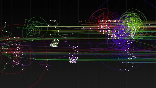
Unlike other Twitter visualizations, the Social Collider application actually has a useful purpose. Use this visualization tool to track hot topics being discussed on the social network. You can also use it to learn how some Tweet topics drop off without responses while others spark extended conversational chains among countless users. The website takes a little too long to load after your key phrase is entered. However, hang in there because the results are worth the wait.
Visible Tweets
The Visible Tweets website is one of the best designed Twitter visualization platforms. On the Visible Tweets homepage, you are asked to enter a word or phrase. Once the words are entered, the Visible Tweets platform displays a constant stream of Tweets containing the key phrase. The results are provided on an amazingly well designed platform of motion typography.
While they may be riding on the coattails of Twitter’s success, Twitter visualization websites provide stunningly beautiful examples of how people are communicating through online social outlets. Although you may be tired of hearing about the Twitter craze, online social networking isn’t going away any time soon. At least these platforms display social networking in a more artistic, beautiful fashion. Twitter visualizations show what is possible when you look at something from a completely different perspective than the masses.
