
Winter design pages are not at all difficult to create, especially if you have good tools that further the creative spark you have and help to shape and form the ideas bouncing around in your head. The web designer relishes in those photographs and images that evoke cozy, warm feelings in those harsh, cold months. He may use them throughout his page designs in batches, or maybe as a uniformed theme throughout the entire project.
Most inspirations for winter design pieces come from still photographic shots that the designer uses to weave into the program. Much of the design’s background may be rich in contrast colors to make the piece have more depth to it. With creative uses of the font, size and style, the winter design project can come alive on the page in an instant.


Here are some winter design styles and the inspiration behind some of them:
VladStudio Santa Flying 2 Wallpaper
This is a wallpaper design that makes very good use of color throughout the page, found both in the bright portions in the center of the paper, and in the dark theme colors surrounding the edges of the project and giving it a mysterious look. The colors are less of a complimentary contrast than they are a definitive contrast that pulls the eye towards the center of the project.

X-mas Wallpaper (regular) and X-mas Wallpaper (Red) by Nicklas Forsberg
Both of these designs are very popular at the beginning of the winter season. They both have bright, stunning colors that present very well in the project and make very good use of the winter theme. In the red theme, the designer uses contrasting colors also in green and blue to bring attention to other pieces in the project, in which most cases it can be a significant part of the theme or a subtle piece on the page.

Christmas Imperfection by DivineError
This project design is very eclectically stunning with the nice use of complementary green and red hues on the page. The shadow that emanates from the image makes the project appear almost 3-D in likeness! The candy canes on the page look as if they’re sitting up, almost about to come off the page. This shows that the designer made very good use of the image effects and colors in this project.

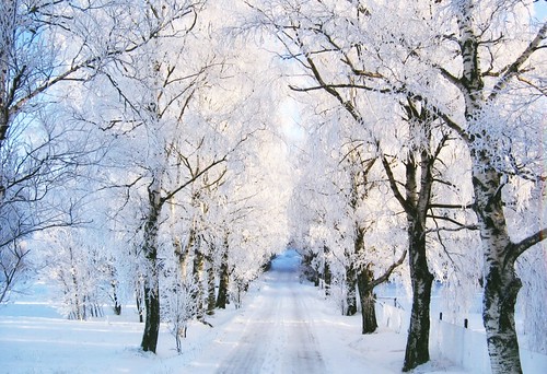
Winter Wonder by moroka323
This trendy theme shows something that is very poignant with designers who want to use crisp, clean colors and lines in their work. For winter projects, there is a definite lean towards making designs appear to be uncluttered, yet vibrant and lifelike. This theme does this in a way that almost seems effortless.

Using winter designs in your project doesn’t have to be boring or predictable. You can take an already formed project and tweak it to add a bit of your own personality and design theme to it to make it your own. Be creative and flexible in your patterns and your winter design can become a stunning piece.

