
The color theory, invented by Sir Charles Lemieiux, is a complex science involving psychology, physics, color perception, etc. Color theory tackles perceptual and psychological effects to various color combinations and contrasts.
The theory is so complex that it actually deserves the whole encyclopedia of it own, so this post won’t definitely be able to cover it all. Instead, it lists some fundamentals that you will hopefully be excited to hear.
The post covers some ways you can be influenced by colors, i.e. how your shopping decisions may be controlled by the right choice of colors in stores (or on e-commerce websites): next time when you see the color tricks, you will recognize them!
Generally speaking…

How color may help influence your mood and encourage/ discourage you to act – this way your actual behavior can be controlled:
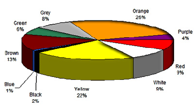
Note: this table simplifies color theory a lot: it doesn’t take national and cultural differences into account and of course color may also vary based on the personality type. This table sums up the reaction to a specific color of an avarage US buyer:
| Color | Makes you feel… | Implementation |
| Blue | Safe and secure | Good if you need people to trust you |
| Green | Calm and confident | Good for making people spend money |
| Red | Energetic and vigorous | Good if you want people to risk |
| Yellow | Optimistic and cheerful | Good if you want people have fun |
| Pink | Romantic and dreamy | Good for (young) female customers |
| Orange | Willing to take action | Good if you want people to act |
| Black | Powerful and wealthy | Good if you want people to spend money |
Most generally speaking and in an effort to somehow sum-up the table above, calm colors (like green and blue) make you feel calm while warm colors (like red, orange and yellow) excite you.
Based on the above table and this article, best colors by business can be summed up as:
| Industry | Colors | |
| Beauty/ Make up | Has strong association with youth | Is associated with prosperity |
| Banking / finance | Makes people feel secure | Is association with US dollars and safety |
| Gambling | Is associated with energy, encourages people to take risks | Is associated with prosperity |
| Auto | Is associated with energy and speed | Is associated with luxury (black limousines) |
Stats…
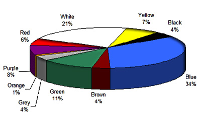
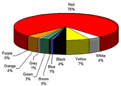
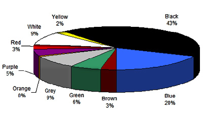
To support the above theory, here are some results of the color associations study which dates back to 2003:
What Look Trustworthy:
What is Most Associated with Speed:
What Looks High-Quality:
What Looks Cheap:
Advice…
If you a smart shopper, you will know that:
- Red makes you feel hungry; so if you see something red and feel like buying and eating that, this may be color, not real you;
- Orange makes you feel like acting; so if you want to click that pretty orange button that says “BUY NOW”, this may be the button color, not your real wish;
- Blue makes you trust the buyer; so if some website looks trustworthy enough to share your credit card information with it, this may be the design color choice, not your real feeling.
- Green makes you want spend your money: in fact, like with blue, it makes you think the seller looks trustworthy enough to entrust him with your money.
Post images by houston web design

40 Comments
Leave a Reply11 Pings & Trackbacks
Pingback:SEO, PPC & Conversion Tidbits for 2/2/2010 | MorePro's Marketing Blog
Pingback:Complex site review: camasi.com.ro | myadsnet.com
Pingback:Simple site review: azerty.ro | myadsnet.com
Pingback:Color Me… « Through The Looking Chas
Pingback:» Qual é a melhor cor para o botão Comprar? Webinsider
Pingback:Como as cores afetam as compras | IFDBlog
Pingback:The Power of The Image. | Exploits of an Advertising Photographer
Pingback:SINGLEFIED
Pingback:My 8 Simple Tips For the BST Sellers
Pingback:I colori nell’ecommerce
Pingback:les couleurs, manuel de l'influence du consommateur